Screens
Thomas Lin Pedersen
Description
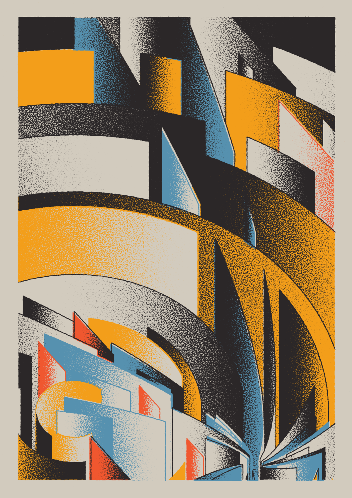
“Knowing the answer is the killer to creativity.” So states artist Thomas Lin Pedersen, creator of the Screens collection who keeps his generative codes a secret and strives to create pieces where one cannot discern that there was ever a code behind its construction. Screens uses a generative code to mimic the art of silk screen printing, using strong geometric shapes rendered isometrically. Similar to the mechanism of silk screen printing, each layer is generated with a set of discrete colors and then is converted to a black and white grainy image, after which the black parts are colored and then that template is merged with the master image. Each layer is ordered in increasing darkness to mimic the ways in which one would layer paint, with darker colors showing up over lighter ones. Each composition is made up of either circle, square, radial, straight, or spline actors, and the scenes feature heroes, collapses, companies, antagonists, crowds, or order and chaos, each feature contributing to a more complex and chaotic output.
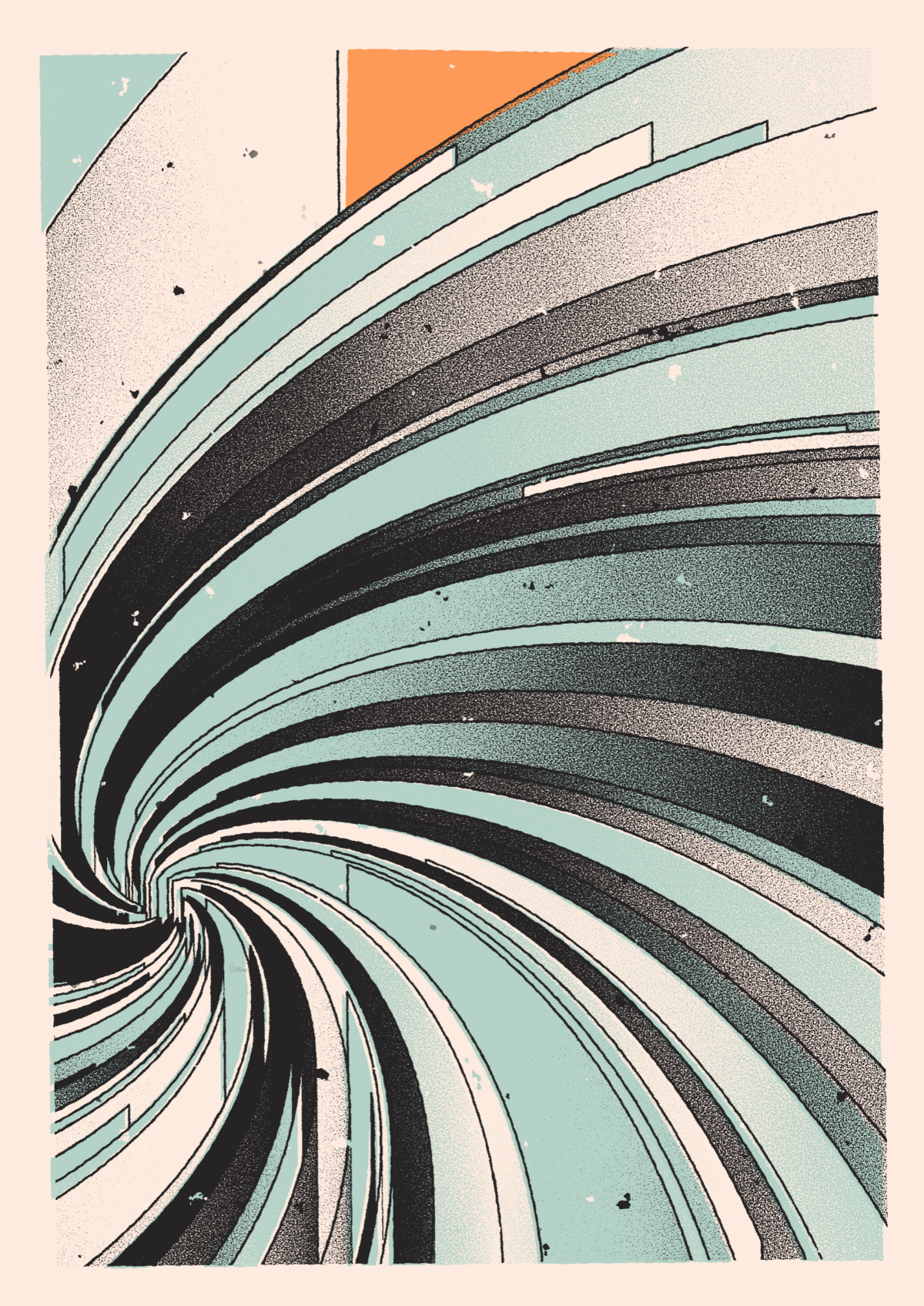
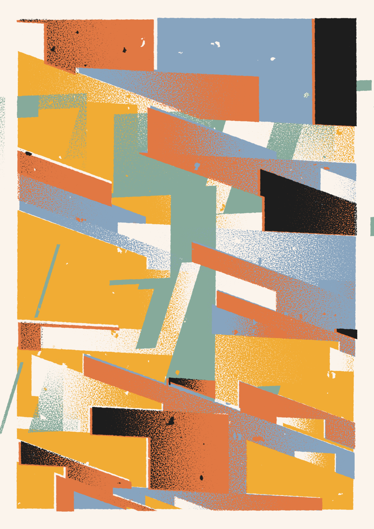
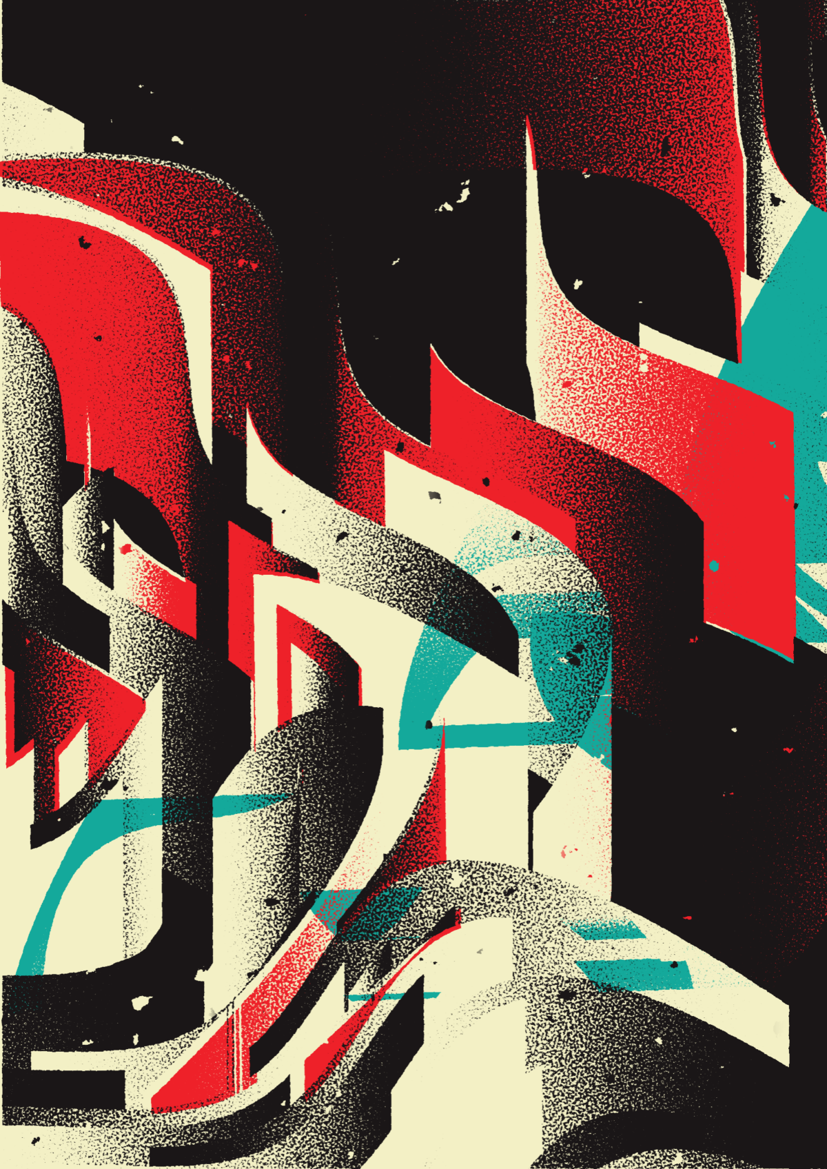
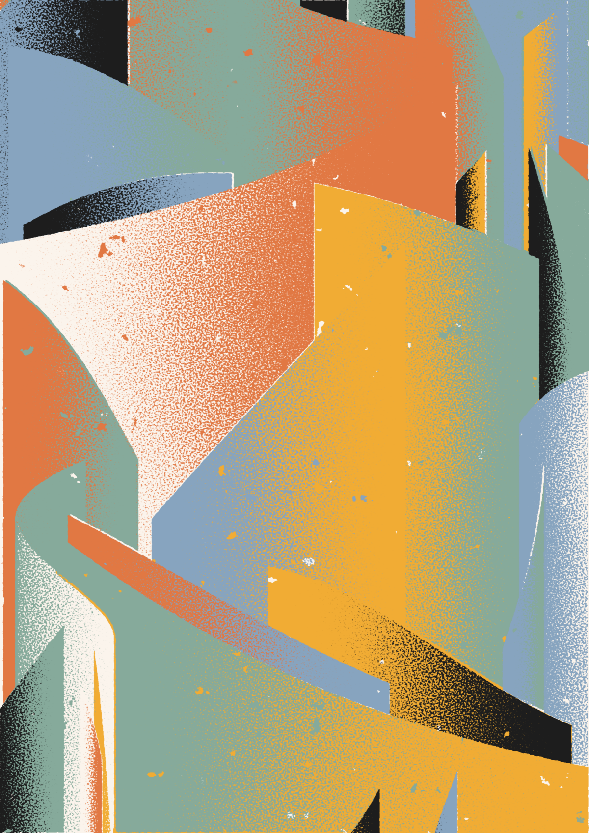
Screen 43 features a hero character with a radial actor so that the entire image seems to be centered upon one burst of lines, driven by a sole force. The fine grain pattern and Iceland color palette of cool minty blue, gray, icy white, and a touch of goldenrod inspire feelings of superhero comics, the explosive and startling twist of a fanlike spray. In Screen 318, the bright, vivid primary colors of Bauhaus palette feature an antagonist style, wherein multiple and varying heroes are at odds, showing a split image where the intersections differ and conjure a sense of chaos and mayhem. The alignment is sloppy, and when the alignment is off, such as in Screens 210 where it is drunk, the image takes on a haphazard wildness of shape, line, and color. Similarly, Screens 175 is drunk and features a Berlin color palette of blood red, lovely teal, and black, layered beautifully rising like gentle flames against a black sparkling backdrop. When an image contains precise alignment, such as in Screens 57, the effect is more ordered, for even though it contains a great number of heroes and has the greatest potential for unique compositions, all of the screens share a common dynamic and seek compositional harmony.


